As a REALTOR® there is an expectation of you to create certain “basic” images.
Basic images include headshots & listing photos. Virtually every real estate agent needs those two pieces of content by default in order to compete. Once they’ve acquired those basic images, it usually goes into a few basic areas:
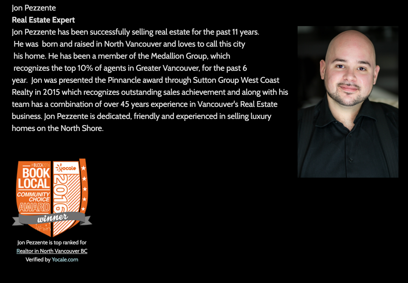
- Headshots: go into business cards, email signatures, outdoor & print ads, and the About Me page on a website.
- Listing Photos: get plugged into MLS®, feature sheets and perhaps some social media posts & emails.
That’s the formula for basic real estate content being promoted in basic locations. If this formula sounds similar to your own, don’t worry. It doesn’t mean you’re basic. It just means you haven’t had the chance to optimize this aspect of your online presence.
Well here’s your chance. Today I’m talking about the correct way to use images on your real estate website – the way that’s going to earn you the most visitors and keep them around longer.

As a real estate agent, you have a head start over other businesses because you have to create a baseline amount of content – listing photos. But those listing photos can be leveraged in more places than simply on MLS®.
Not only are images useful marketing tools for capturing a human’s attention, they are also very powerful for capturing search engine attention. Pages and content with relevant images get 94% more views than without. (Source)
[-_-]~~ Ninja Tip: Download The Ultimate Guide to Designing Epic Social Media Images, by Venngage
Repurposing your available content can be powerful, but producing unique imagery specifically to help acquire and influence visitors is a whole other story. I’ll cover both concepts through the sections below.
Hope you enjoy, and as always leave me any questions or remarks in the comments.
Of You or By You
Headshots are headshots; you’re gonna get them … but some real estate agents have professionally staged lifestyle photos (or “stock” photos) taken of them as well, which often feature them in action somehow. Showing a house, in a meeting, in the community, etc.

Other agents are using personal/professional social media networks like Instagram or Facebook. Where they frequently post selfies with friends, travel photos, food pics and more.
All of the images mentioned above paint a portrait of you, your lifestyle and your real estate brand. They should be leveraged throughout your website – not just on the About Me page or just on Instagram.
Try embedding a few photos you’ve taken and posted on Instagram into your “About Me” page to showcase your interests (don’t forget to link your related social media account). Inject your headshot and pro stock photos into your homepage and contact page.

Give visitors something to keep their eyeballs entertained while they visit with you by including yourself and your creations throughout your REALTOR® site.
Listing Photos
If you regularly have professional photos taken of to market your listings, chances are some of them have turned out pretty freakin’ nice.
Although I know a lot of agents who produce awesome HD listing photos for their properties, I know very few who leverage those images correctly online.
Publishing your listing photos on social media is excellent, boosting them with some advertising dollars is even better. However, both of those tactics aim to drive a lot of attention for a short period of time. You should also be employing some tactics that drive a little attention for a long period of time.

Try picking 10 of the best listing photos you’ve ever produced for clients and injecting them throughout your site. Show potential clients the type of quality you offer, use your own visuals as your website’s homepage banner, create a recurring “10 Best Listing Photos of the Month” blog post… the list goes on.
Graphs & Charts
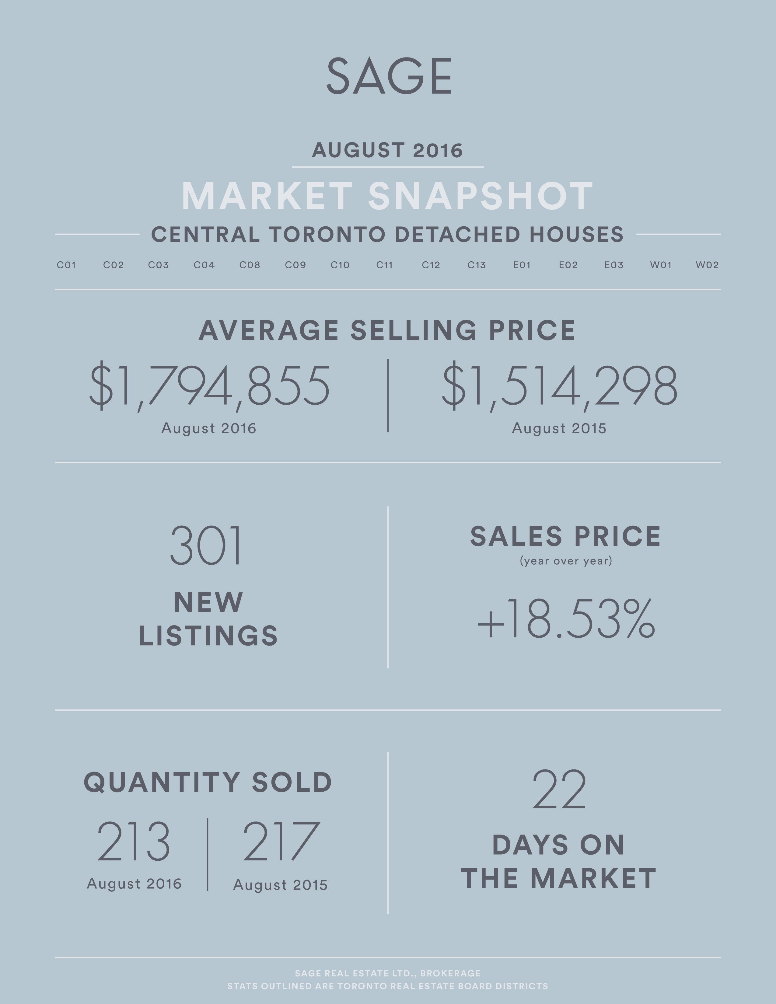
The average person doesn’t digest a table full of numbers very well, and the real estate business (and industry) is one that is measured numerically.
Regardless of whether it’s Toronto’s November real estate market report or a drawing of a cat, the core objective of all content is: to transfer information from one brain to another as efficiently as possible.

Using graphs, charts, diagrams, infographics and other visual representations of complicated numbers and info, you can turn generic real estate data into very interesting and easily digestible content.
“Research has shown that when people hear information, they are likely to remember only 10% of that information 3 days later. However, if a relevant image is paired with that same information, people retained 65% of the information 3 days later.” (Source)
For your next “Market Statistics” blog post, try replacing some of your percentages and figures with pie charts and bar graphs or infographics. Include some of your own unique commentary, and you’ve just turned some generic data into an awesome piece of content – just by using visuals.
Community & Hood Photos
Community photos can take various shapes and forms. Some agents will hire a professional to take capture some unique photos of the community they serve. Others will take matter into their own hands.
Producing your own content is better than not producing content (1 > 0), but working with a professional has it’s benefits too. Ideally, you’ll want to do a little bit of both.
Use your social media channels to publish your own community related content, like a photo recommendation of your favourite meal at the local bistro. Use professional photographers to produce HD neighbourhood photos that you can use throughout your marketing communications – online and offline.
Take all of the above professional and amateur images, and inject them into your real estate website. Use the HD shots in prominent locations around your site such as in the header of all pages, or as the (rotating) banner on your homepage. Most importantly, use the professional photos on their own community-specific pages of your website.
And don’t forget about the amateur photos you took yourself! Those can be added to your website pages as well, to give visitors a further connection with – and understanding of – your brand.

When someone arrives at your website, there should be no question as to what market you’re serving. They shouldn’t have to scroll or guess, they should just know. Use your images
Media Mentions & Offline Advertising
I know it’s 2016 and so much marketing is happening online, but so much is also still happening offline. Take a look at your real estate business and think about all the offline marketing initiatives you currently engage to promote yourself.
There are probably a few of the following items on your list:
- Mention in the news (PR)
- Bike rack ads
- Transit shelter ads
- Transit back/side/wrap ads
- Newspaper ads
- Magazine ads
- Direct mail flyers
- Direct mail notepads
- Door hangers
- The list goes on
These are all individual pieces of content that you’ve created to promote your business. For the most part, you can include these on a special page on your real estate site called “In The News” or “Our Advertising”.

One of the greatest sources of online content is our offline content! Think about what you’re doing to promote yourself off of the web, and consider adding that to your REALTOR® website! If it makes sense, of course. I probably wouldn’t add a scan of my direct mail notepads on my website… unless of course they could order some directly!
Don’t forget that people often find your site through image searches… always add relevant ALT and TITLE tags to your images. This simple tweak will help you attract more of the right traffic towards your site and images.
Avatars & Icons
The devils in the details when it comes to your real estate website. Little visual mods like avatars, icons, signatures, buttons, and other miscellaneous graphics can encourage visitor engagement and attention.
Take a look at your REALTOR® site right now. Click through all the pages and make a mental note of how many times you see a Call to Action (CTA)… Could be contact info, a button, a form… anything that turns a visitor into a lead.
Now look at the CTAs again and note which ones really stand out to you with visual impact. Is there a splash of colour? An animation? An arrow? Anything visual that helps bring the visitors eyes to where you want them?
If not, it’s time to start strategizing. What kind of small icons and visuals can you inject around your website pages to make your CTAs stand out more? Here are a few random ideas to get the creative juices flowing:
Link to download a PDF?
Add this icon next to it:
Offering real estate tips on your blog?
Include an emoji of yourself next to each tip:
Adding a personal note to your About Me page?
Include your autograph at the end:
Want to attract attention to a Seller’s Lead Form?
Add an animated icon to the page:
Want to increase the number of lead emails you receive?
Include a prominent button on every page:
I think you get the picture… Now go jazz up your own real estate pages with some awesome visual aids that will direct attention and drive action!
Testimonials & Logos
Nothing does you service quite like a genuine, glowing testimonials from real people. Furthermore, nothing does your website service quite like visuals.
Try capturing photos of your happy customers, and including them next to their testimonials. It feels a lot more like real word of mouth when you can tie a face to someone’s words. It’s genuine, human, and more easy to connect with – to trust.

The same way that testimonials from happy customers can improve your credibility online, so can aligning yourself with the right brands. Are there businesses that you happily recommend, or that tend to recommend you? Have you won any real estate awards in your market? Include any relevant logos on your website in strategic ways.
You might tuck the logos of businesses you’d recommend into their own page, perhaps a “Services You Need.” However with the awards, you’d want to display their logos or icons right on your home page, on your About Me page and maybe other pages too. You might even place them in your website header or footer so they appear on every page.

Think about every company and individual that you interact with through your real estate business. Now reach out to all of them, and either ask them for testimonials and photos or logos and backlinks!


