A powerful, elegant real estate website design is within reach.
But where do you begin?
Your website is an extension of your real estate brand as a whole. It’s one of your marketing tools and whether you like it or not, it represents you on a regular basis. A REALTORS® website is experiential. It tells part of your brand story to visitors through its design and functionality. Are you smooth and professional, or messy and hard to deal with?
What’s story is your current website telling?
According to Adobe, 38% of people will stop engaging with a website if the content or layout is unattractive. That represents a pretty serious chunk of your website traffic if you think about it. Are you willing to let 38 out of every 100 people leave your website without exploring further or taking action?
Before you can begin working with a designer on updating your website, you need a brand vision. Ask yourself a few of the following questions:
- Who are you? Who is your team? Your brokerage?
- What do you want people to think when they visit your website?
- What’s your tagline? What’s your mission and vision statement?
- What are your personal and professional values?
- What type of property are you primarily selling?
- What city or neighbourhood do you serve?
- What’s your area of expertise?
- What makes you unique?
Despite how casually I’ve listed them in bullet points above, these aren’t always easy questions to answer. Take a look at your real estate website design and ask yourself if it matches the vision you have for your brand. If the answer is some variation of “No” then it may be time to speak with our design Ninja, Roxanne Dupuis.
Before you give her a call, Roxanne has some visual inspiration to share with you. Have a look just below at five awesome real estate website design customizations that Roxanne personally created for RealtyNinja clients – and read her notes about each client’s project!
Craig Veroni / www.craigveroni.ca

Roxanne’s Notes: “Within the past couple of months, Craig had a complete re-branding done with our friends over at yourdesignhere.ca, and he wanted a total overhaul of his website design to go with it. Previously, he had been using our standard Shinobi theme without many customizations applied. This worked for his old simple logo – but a nicely polished identity deserves a site with a similar feel to show it off.
We introduced a few contemporary ideas like the video header showing a time-lapse video of the Lions Gate Bridge, and the randomized photo banner (refresh the page, it changes every time!). Working with strong brands is my favourite because I can use elements of it throughout the page, like you see in the separators. In all, I believe the site design displays him as a strong, real estate authority that you could meet at Tap and Barrel Shipyards in North Vancouver on a Friday night!”
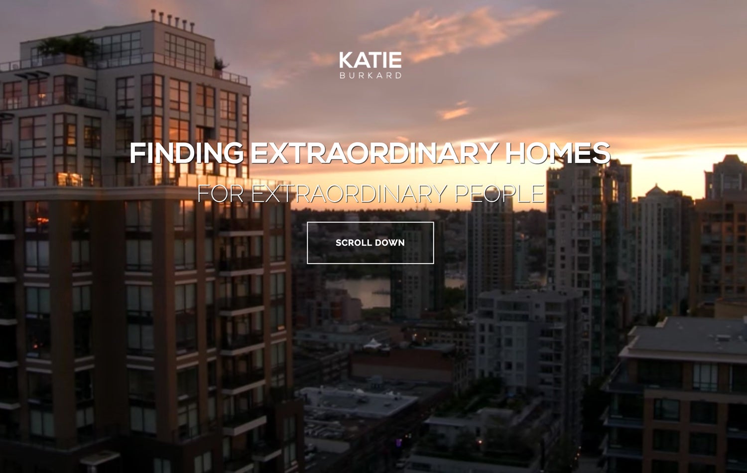
Katie Burkard / www.katieburkard.com

Roxanne’s Notes: “Katie has always been at the top of our “best dressed” lists for website customizations, and her latest changes are no different. While exploring different ideas surrounding her new partnership, we once again pushed the boundaries of our Shinobi theme.
Katie helped us trail blaze the video header that sits atop the navigation. Below the video we wanted to introduce better flow to the page so we switched from the usual rotating banners to a 3-section banner. I think this is a great solution because visitors receive all the information right away – and it rewards you when you hover over it with an animation – try it out!”
Dana Friesen Smith / www.danafriesensmith.com

Roxanne’s Notes: “Right away, I knew I was going to love working with Dana. She knows her market and how to appeal to them. My objective was to make her site appeal to luxury-seekers and show off her amazing personality. It’s important for a site to give a glimpse into what it’s going to be like to work with you through it’s design – and I believe Dana’s site accomplishes that well.
Seeing our modern Shinobi design paired with her playful yet royal branding makes the site feel very welcoming – and who doesn’t love that shot of Garibaldi lake?”
Arash Solaimani / www.solaimani.ca

Roxanne’s Notes: “I always find that sites with dark backgrounds are more challenging because it can feel a bit cramped and claustrophobic. I was thrilled to work with Arash on designing his site and proving that dark backgrounds CAN work! The only extra part to his customization was his rotating banners (check out how it fades in when you load the page!), so it just goes to show that a great site design doesn’t have to break the bank!”
Matt Kusiak / www.mattkusiak.com

Roxanne’s Notes: “This is another standard customization that I love because it shows Matt’s personality. His tagline is “A fresh perspective” and I wanted the design to reflect that while appealing to the Sea-to-Sky market. It’s refreshing to work with people who are willing to break the mold and try different ideas – I usually try to think outside the box and suggest ways to stand out amongst your competition. Pairing the crisp, modern typeface with a script that shows a bit more youth and fun works super well in this design. It brings a smile to my face when I see it! I hope it does the same for his clients.”
If you want to see more RealtyNinja website design customization examples, visit our website -or- contact Roxanne via support@realtyninja.com or by phone at 1 -888-767-7421.


