As a REALTOR®, one of your primary objectives is lead generation.
The more leads you generate the higher your chance of converting one to a client. Quantity doesn’t always make up for quality, but the agent with 100 leads is generally more likely to convert one than the agent with two leads.
So how can you “turn up the tap” and start earning yourself more quality leads? In truth, there are dozens of modern lead generation ideas that work when executed correctly, and are equally worth discussing. However in the name of brevity, for now we’re going to hone in on the best practices for one of those ideas:
Real Estate Landing Pages
A real estate landing page is technically any page of your real estate website that a visitor “lands” on from a different website or source. When speaking about landing pages in the context of marketing however, we’re referring to a standalone page separate from your website.
A marketing landing page is a web page which has been constructed for one specific objective and which encourages visitors to take some sort of action. Ideally – and in an effort to maintain a single focus – these pages do not include the same main navigation menu that your website does.
In case you’re interested in optimizing one of your lead-gen funnels, I’ve broken down the anatomy of an awesome real estate landing page below. At multiple steps I have included screenshots from one of the many* RealtyNinja landing pages we use to promote our websites.
Our landing page from the demos below is not focused on selling real estate, yet we use it as an example anyways because the principles and lessons can be applied to all landing pages.
* Just as more nets catch more butterflies, more awesome real estate landing pages generate more leads.
Objective
Landing pages have many different objectives.
They can be used to:
- acquire private showings of your new listing,
- help you grow your mailing list,
- drive traffic to your REALTOR® website,
- promote your latest buyers and sellers ebook,
- generate leads from buyers looking to buy property,
- give potential sellers a free home evaluation,
- and much more!
When a visitor “lands” on your landing page, they are expecting it’s contents to match the ad that they clicked to arrive there. If your ad says “Download my new ebook”, then the landing page must focus specifically on helping visitors download your ebook – therefore converting them from visitor to lead.
You must know your primary objective well to focus your landing page on achieving it.
Headline
The headline of your real estate landing page is an extremely important component when it comes to converting visitors into leads.
The headline should be the first thing that catches a visitor’s eye once they arrive on your landing page so use large and legible fonts and contrasting colours (ie. white text on dark background).
The headline should also match the ad copy that sent them to this landing page. For instance if your Google Ad says “Free evaluation of your Vancouver home”, the headline on your landing page should repeat something quite similar, if not the exact same thing.

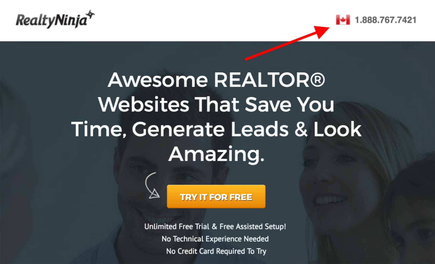
The headline is at the very top of the RealtyNinja landing page. The only thing above it is our logo and toll free Canadian phone number. It is also in a clearly legible, bold font and it matches the advertisements we use to drive visitors to it.
Plan your landing page headline carefully. Make sure your visitors know what the landing page is all about before they get confused and exit the page – which happens very quickly!
Call to Action (CTA)
A distinct CTA should present itself at least once on your landing page. We have five on one of ours.
Before you can design your CTA and begin injecting it into your landing page, you must decide: Is this is landing page A) Lead Capture or B) Click Through?
A lead capture landing page is equipped with a CTA that captures a real estate lead’s information in order to contact them in the future. A click through landing page is armed with a CTA that sends the visitor to another link – often on your actual website, one more small step down your sales funnel.
Say yours is a lead capture landing page and your objective is for visitors to download your new buyers and sellers ebook. You would include an embedded form right into the landing page, and ask for an email address (maybe name too, but less fields often = more conversions).

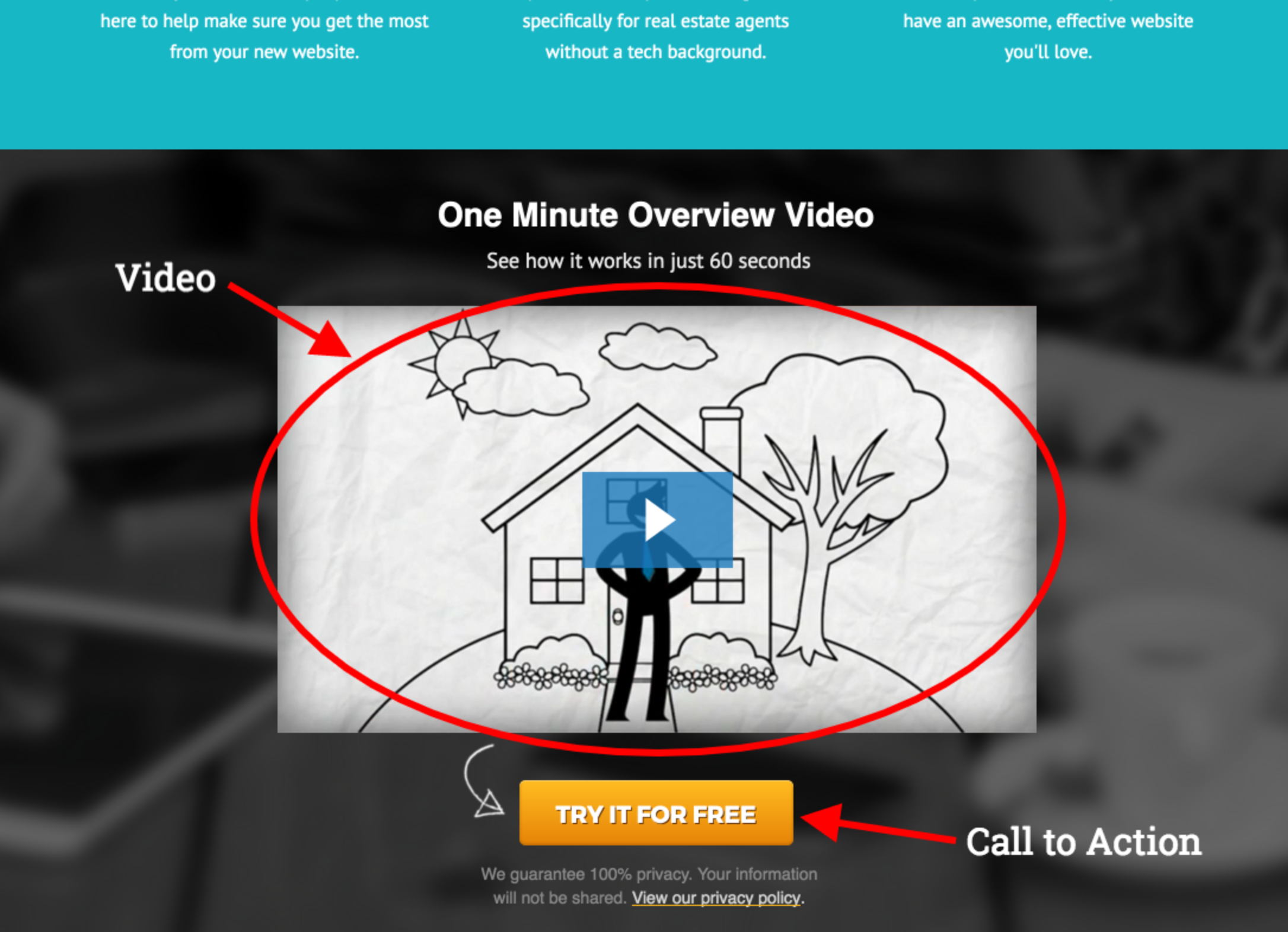
The objective of one of our landing pages is to encourage those who arrive there to try out a RealtyNinja website for free. Ours is a click through landing page and we have designed a bright orange button that says ‘TRY IT FOR FREE’ which appears five times throughout that landing page.
No matter what your CTA, make sure it stands out amongst the rest of your page. Do this using contrasting colours if you need to. And do it more than once throughout the landing page.
Unique Selling Proposition (USP)
Now that you’ve set your objective and decided what your call to action is going to be, it’s time to start designing the actual landing page.
Your USP could be that you’ve sold 300 homes in the area, or that your listings are sold in 15 days on average. Your USP could be your brand tagline, or it could be something new. For instance, if you have created a one-of-a-kind piece of content, the unique selling proposition would be that it’s one-of-a-kind.

Our USP is mentioned throughout our website as well as on our landing page. RealtyNinja is unique in that we offer an unlimited free trial and a free assisted website setup. We’re also one of the only services of our kind that require no credit card information to try and no technical experience to create a real estate website by yourself.
Your USP is what makes your brand or your offering special or unique. Your USP should appear quite early on in your landing page, briefly giving the visitor a couple extra reasons why they should convert into your lead and not someone else’s. Why are you different, and better?
Features, Advantages, Benefits (FABs)
In some ways, features, advantages and benefits is a fancy way of saying “your sales pitch” – and your sales pitch must be present on your landing page.
A FAB statement shows a feature of your business, explains what it does (advantage) and then romances how it will benefit the customer’s life. The difference between USPs and FABs is that the FABs are often not unique to your business. Often times they are expected. You may [need to] have many of the same FABs as another agent in your market, but your USP would set you apart.
As a real estate agent, one of your FABs might be:
- Feature: You use drone videos to film property tours.
- Advantage: It generates more interest in the listing.
- Benefit: It helps sell a listing for a higher price, and more quickly.
If I were to put that FAB into a concise paragraph, it might read as follows:
“Get multiple offers on your property when I showcase it beautifully with HD Drone Video!”
Refer back to your objective, and then design at least a few FABs that you can highlight on your real estate landing page – FABs that will help you accomplish that objective!

Our FABs are showcased relatively close to the top of our landing page, and some more of them a bit lower on. The screenshot above shows the initial set of FABs. These are the ones we want you to know about first and foremost – the ones that we think will make you want to continue reading (or click our CTA right away!)
Your FABs tell us about your offering. Whether that offering is you, a property you’re marketing, or an ebook you’re promoting, there are relevant features, advantages and benefits that you must outline.
Video
When possible, I highly recommend including a relevant video on your real estate landing page.
In many cases your video might be of a specific listing and it might be right at the top of your landing page. It could also be an “About Me” video that features yourself. Videos are also a great way to re-iterate your USP and your FABs. Many successful landing pages feature videos that direct you to take further action through the CTA.

Our landing page video gives visitors a one minute overview of RealtyNinja. The video is an animated comic created using PowToon which describes what we do in an engaging and understandable way.
Video is the most engaging form of media, so if it’s possible, embed some relevant video media into your landing page. Remember, make sure the video helps achieve your primary landing page objective!
Trust Indicators
Think of your landing page as a resume. Wouldn’t you include your relevant awards and accomplishments on your resume?
Sure you would. And you should include them on your landing page as well. Do you hold the Royal LePage top 10 award? Are you a RE/MAX Diamond Award Club member? Make sure to mention your accolades in the field on your landing page.
Another trust indicator can be your social media channels. If you have an active Instagram account with thousands of followers, embed it into your landing page. Allow visitors to see how popular you are without you having to even say anything.

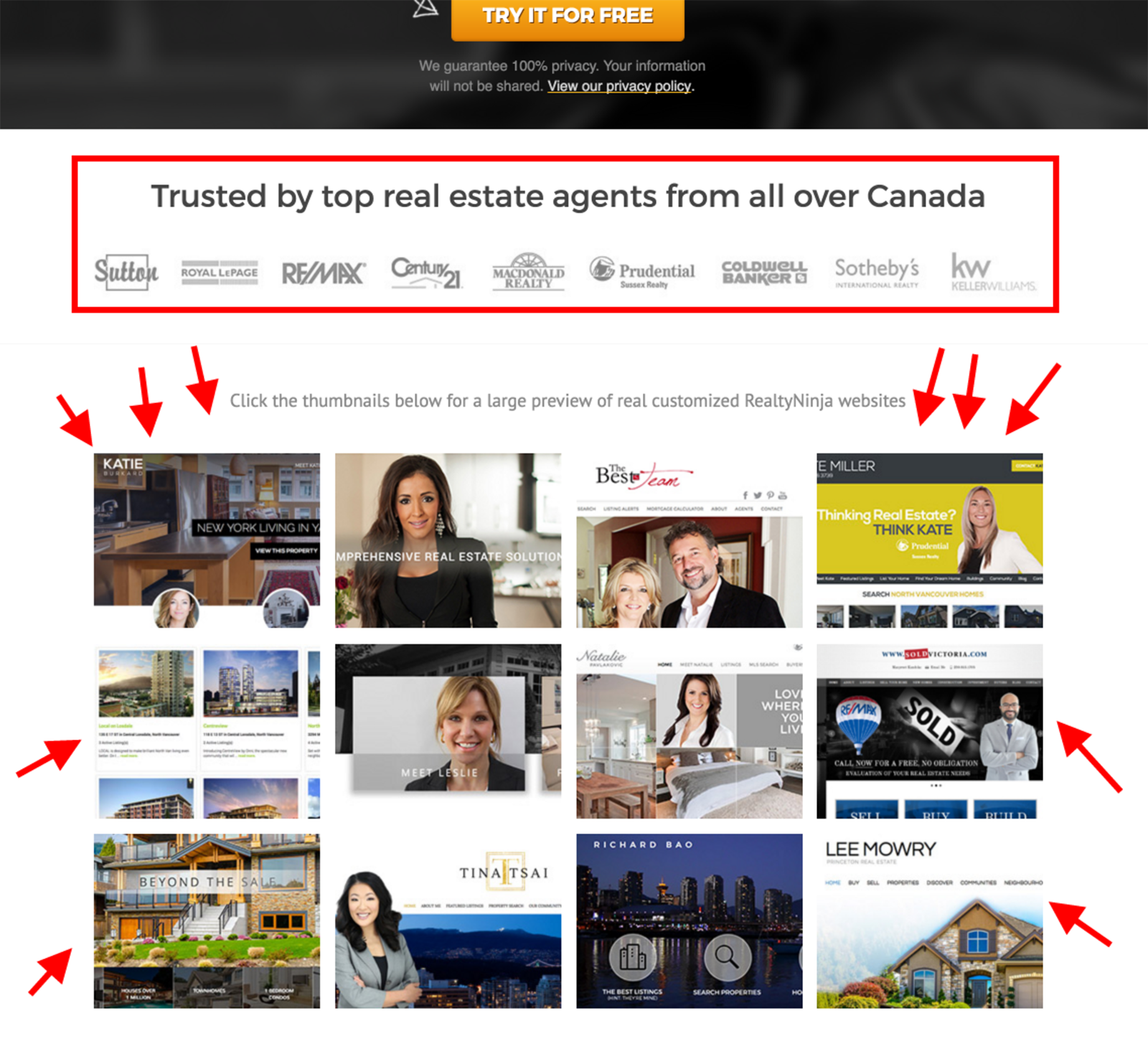
On our landing page, we’ve included logos of the major brokerages whose agents have trusted RealtyNinja, followed by some examples of the actual RealtyNinja client websites (you can click them to enlarge.)
By whatever means you’re able to show that you are capable and trustworthy, do so on your landing page.
Testimonials
A landing page trust indicator that deserves it’s own section is the testimonials.
Whenever you have a chance to let real customers do the talking for you, take it. Word of mouth is a powerful tool for building trust, and a genuine testimonial is hard to fake.
This of course begins with asking your clients and others for testimonials. If you’re not doing it already, start now! Once you’ve amassed at least a few good (relevant) ones, load them into your landing page.
Always keep in mind the primary objective of the landing page. If your landing page is promoting a piece of content, your testimonials need to be relevant to the content itself and not to you personally.

Our landing page contains four testimonials from our world class clients that support the claims we’ve been making via FABs and USPs.
Always include testimonials on your landing pages, but be selective and don’t forget your primary objective.
Contact Info
My thought is, always give visitors the ability to get in touch with you directly through your REALTOR® landing page.
Whether it’s a telephone number or an email address or even a live chat widget is up to you. Sometimes we all just want to talk to a real person. Especially if we’re considering making a substantial real estate deal.
Some may argue that you could make your main CTA your contact information or a link to your email. To that I say asking for someone’s contact info is much easier than asking for them to contact you.

We’ve placed our Canadian toll free number in the top right hand corner of the landing page, and our info@realtyninja.com email at the bottom. Often times visitors to our landing page call and email just to ask a few questions and clarify some information that they read on the page.
Include contact info on your landing page – make it easy for your potential clients to get in touch with you when they want to.
If there is only one idea I’d want to leave you with it’s this: Your real estate landing pages are resumes that you are leveraging to achieve an objective. Stay focused on your objectives!
It’s very important to note that a landing page on it’s own is not optimized to generate much traffic on it’s own through SEO. Normally, landing pages are used as the target of advertising campaigns, online or otherwise. In an upcoming article we’ll discuss driving traffic to your real estate landing pages so check back for that.
Until next time, Ninjas [-_-]~~~
If you’re just getting started with landing pages, take a look at RealtyNinja Hotsteets – real estate landing pages with built-in MLS® search. Our landing page from the screenshots was built using unbounce, a Vancouver-based tech company.


