Design Envy; noun; a feeling of discontent or covetousness with regard to the design appeal of another’s real estate marketing materials.
Have you ever laid eyes on another agent’s listing presentation package and started sweating?
Do you often wonder how REALTORS® in your area create such good-looking Instagram posts?
Does your Realtor® business card pale in comparison to the competition?

Design envy is serious, and it’s happening to agents every day around the world. Today I’m going to give you the means to say farewell to design envy once and for all…
Feel free to scroll down and read through the entire article, or jump to sections using the table of contents below.
PS. We’re giving away a couple of beautiful Canva Realtor® templates for free at the bottom of this article!
Table of Contents
- Introducing Canva
- Real Estate Templates on Canva
- Design Tips When Using Canva
- Free or Pro – Which Version Do I Need?
- RealtyNinja’s Canva Templates for Agents
Introducing Canva – Design Made Easy (for Real Estate Agents!!)
In case you’ve never heard of Canva, let me give you a brief rundown on what it is and how it works.
Canva is a web-based software – meaning you don’t need to download or install anything – that allows you to create impressive real estate marketing and design elements with absolutely no technical graphic design experience.
In other words, if you can type on your keyboard and click & drag things around with your mouse, you can use Canva. In fact, Canva claims it only takes 23 seconds to learn how to use their platform… that’s how easy it is.
They even have an awesome video editor that which makes it super simple to edit and tweak your videos for whichever social platform you use, with the same easy to use drag & drop interface.
To create impactful marketing collateral, you no longer need an arsenal of tools like Photoshop, Illustrator, VSCO Cam, and a myriad of stock photo sites. All you need is this one simple yet elaborate tool – Canva.

The best part about Canva? It provides Realtors® with pre-designed templates that they can build upon. Don’t want a template? That’s fine, you can always start your own project from scratch. Whichever route you choose to go, Canva will hook you up with the appropriate file sizes for your project.
Even expert designers often find themselves using Canva to create content for their clients. Here’s what our friend Alex Wells, Founder and Lead Designer of Uptake Creative, has to say about Canva:
We use Canva to create social templates and mockups for real estate clients to help them achieve greater freedom and control over their own digital marketing. While we are well versed in all the modern graphic design tools out there, Canva specifically brings a level of simplicity and style to the process that reflects in the end result. It really is an impressive tool for anybody, no matter how technically savvy you are. Alex Wells, Uptake Creative
Designing a brochure? Creating an Instagram Story? Sending a Thank You card? Whatever you’re creating, Canva makes it easy and, dare I say, fun. Just select the appropriate template, tweak the features of that template, and then save your file.
In case you’re still not convinced: Watch this quick demo of me making an Instagram post using a real estate template in Canva in less than 2 minutes.
By the way, RealtyNinja is in no way affiliated with Canva – we’re not getting paid or incentivized for writing this – we just think Canva is awesome and want to share it with you, Ninjas.
Real Estate Templates on Canva
You might be wondering if there are any real estate specific templates on Canva – and the answer is: SO MANY!
I’ve compiled a list of the real estate specific templates available below, just click one to check out all the designs in that category (note: you’ll need an account to actually modify them.)
- Real Estate Brochures (30+ templates)
- Real Estate Business Cards (60+ templates)
- Real Estate Flyers (60+ templates)
- Real Estate Newsletters (30+ templates)
- Real Estate Postcards (140+ templates)
- Real Estate Slideshows (10+ templates)
- Real Estate Social Media Graphics (20+ templates)
- Real Estate Videos (20+ templates)
- Real Estate Yard Signs (40+ templates)
Aside from real estate specific templates, there are a wide variety of other templates that real estate agents would find useful. For instance:
- Want to showcase market statistics in a visually engaging way? Use an Infographic template.
- Want to make your Facebook Page stand out? Use a Facebook Cover template.
- Want your next real estate mail-out to look sharp? Use a Letterhead template.
What I’m trying to say is, anything you’re looking to design for your real estate marketing and operations can be found in a nifty template on Canva.
BONUS Articles From Canva:
- 20 eye-catching do-it-yourself real estate flyer templates from the Canva library
- How real estate pros can create irresistible graphics
Design Tips When Using Canva (or any design tool really!)
One thing I understand is that you didn’t get into real estate to become a graphic designer.
That being said, creating content is exceptionally important in marketing, so it’s critical that you have at least a basic understanding of design concepts.
Whether you’re using Canva – or a different design tool out there – to create your marketing collateral, here are some important tips to keep in mind:
Limit the number of fonts you’re using
For font’s sake, don’t use too many different typefaces in your real estate content. Try to stick to 1 or 2 different fonts per design. Too many fonts make your design look messy and hard to read, reflecting poorly on your real estate brand. Plus, it’s hard to find 3 or more fonts that even look good together in one design!

White space is important
Give the various elements in your design room to breathe. Don’t cram too many shapes, symbols, elements, text boxes, and images into one design – it can get claustrophobic! Make sure there’s a decent amount of space around the elements in your design. The space between the elements is known as white space, but it doesn’t have to be white – it could be whatever your background colour is (like pink!)

Use a limited colour scheme
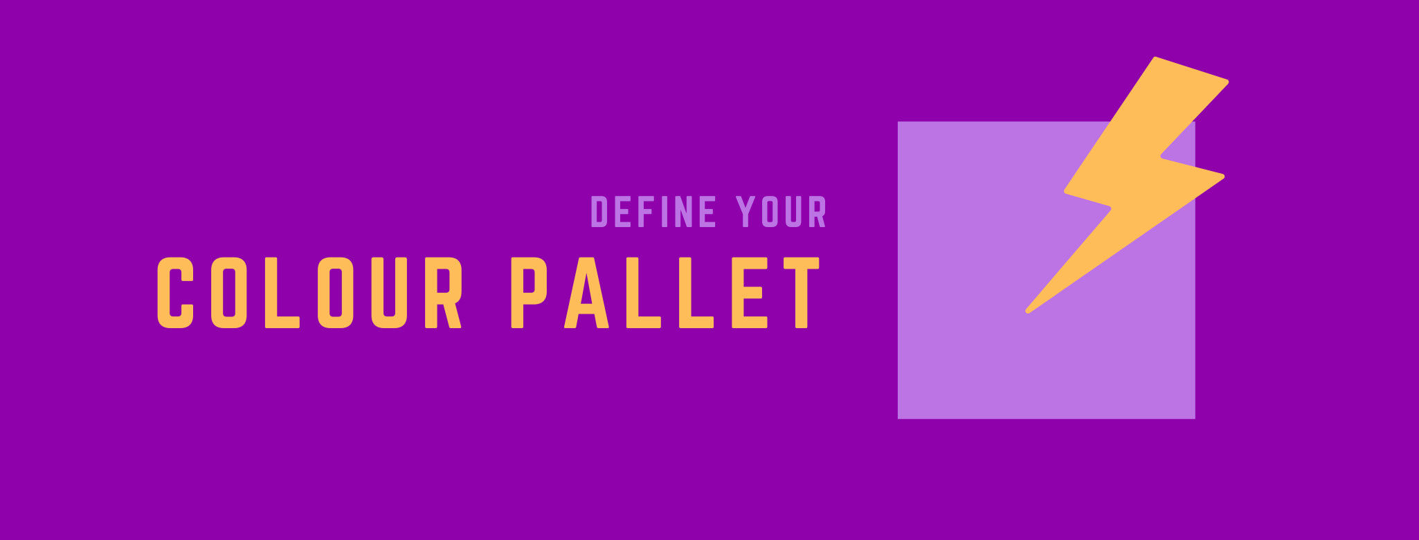
Similar to fonts, your colour scheme for any one design should be limited to a small pallet. Think of colours that contrast and complement each other well – like a golden yellow font on a deep purple backdrop, with lavender subtext. You should also keep your brand’s colour scheme in mind when designing. If your real estate brand colours are black and red, perhaps purple and gold wouldn’t be the best approach.
Contrast is a Cardinal Rule
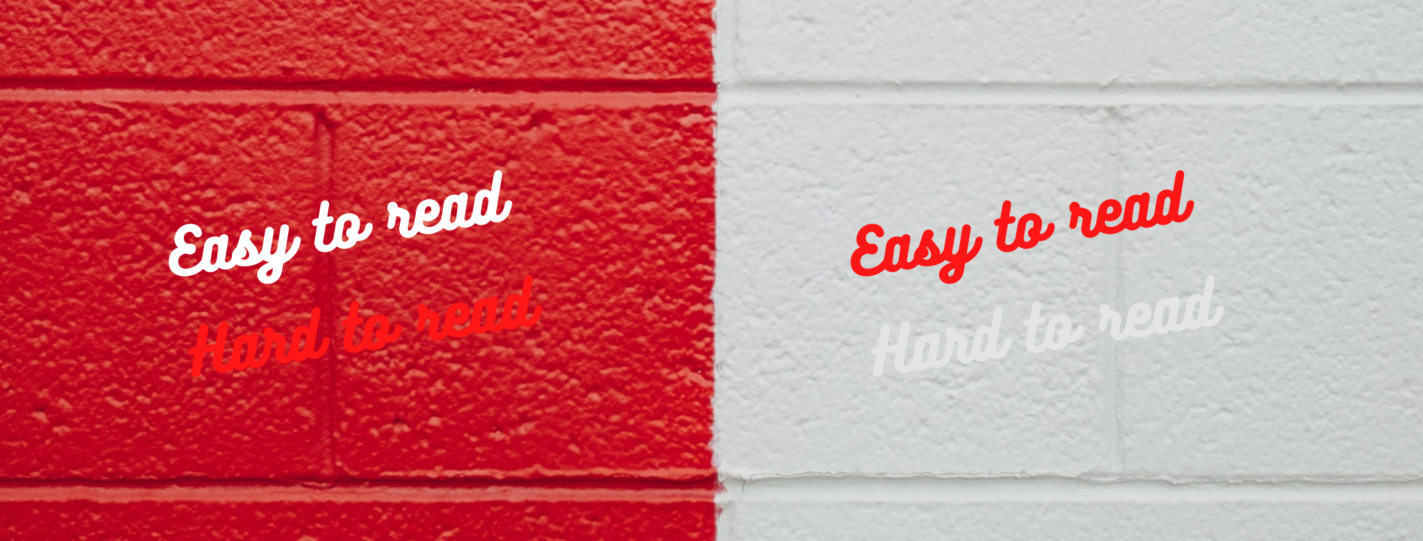
Without darkness, there can be no light. Similarly, without dark elements in a design, the light elements will be much harder to see (and vice versa!) Be sure to contrast your colours so that they stand out against one another. Red text on a red background is invisible, but white text on a red background jumps out at you! Contrast is a fundamental principle to your design, real estate, or otherwise.
Keep the whole thing simple
Generally speaking, when it comes to design less really is more. The fewer elements you have in your design, the more each of those design elements can stand out. Try using simple backdrops and simple fonts to create impactful content. Reduce the message you’re trying to convey into the smallest possible denomination and you’ll find designer bliss.

Imitate but don’t copy
Imitation is the highest form of flattery, after all! There is an infinite number of designs out in the world that can spark your inspiration. Use those designs to create your own content, but don’t just copy other designers outright. Bring your own creative process (we all have one) into your design, while using what others have done as a guide.

Align images to a grid
One surefire way to make your design look like it’s from the ’90s is to float images all over the place. This is a messy aesthetic, and will negatively impact your brand. Keep your design clean, tight, and professional by aligning your photos into a grid or table.

Think of the items I mentioned above as a “crash course” in real estate design. Should you feel hungry for more design tips, there are tons of articles about good design principles on Canva’s design blog, so feel free to dig deeper there.
By the way, every image you see above was created using Canva ?
Free or Pro – Which Version Do I Need?
The good news is Canva is completely free to use. Their free model includes enough to keep your real estate business looking great, potentially forever.
However, there is an upgraded version, should you choose to unlock some extra features. The pro version is $16.99 CAD per month or $155.88 CAD per year (annual is over 20% off).
You can find the breakdown of the features and pricing here, but to sum it all up here are the important differences:
Pro gives you over 300,000 more free templates to choose from
With Free, you still have access to 8,000+ free templates.
Pro gives you access to a Brand Kit, where you can identify your brand’s logo, colours, fonts, and more – which makes keeping your designs consistent that much easier
With Free, you will need to remember your brand identity and apply it yourself each time.
Pro allows you to upload your own fonts into their system
With Free, you have to use the fonts Canva provides.
Pro allows you to create your own templates for future use
With Free, you can only modify their templates.

Pro grants you access to over 75 million stock photos, videos, graphics & images
With Free, you get a much smaller bank of stock photos and images to choose from.
Pro gives you 100GB of cloud storage for your own uploads and files
With Free, you get only 5GB of cloud storage (still quite a bit!)

So while Pro features do provide a great deal of value, they might not be necessary for real estate agents. At least while you’re just starting out with Canva.
As long as you’re okay using Canva’s pre-loaded fonts, okay with manually applying your brand style to designs, find what you need in their free templates, and can get your stock imagery from sites like Unsplash or Pexels, you should be totally fine with a Free account for years.
RealtyNinja’s Canva Templates for Agents
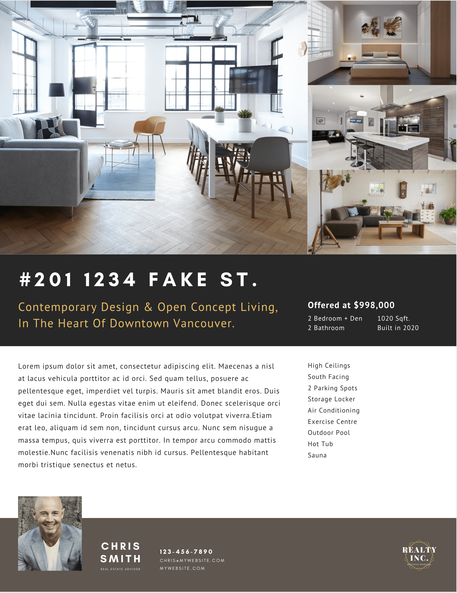
To help you get started with Canva, we’ve created some templates for you to use for your real estate marketing. We’re giving you 3 of them for free today (just fill out the form at the bottom of the page.)
The 3 free templates include a Realtor® Listing Sheet Canva template, a Realtor® Notepad Canva template, and a Realtor® Open House Postcard template.
Here’s a sneak peek at the fully customizable Canva real estate templates we’re giving you for free today:
Free Template 1: Realtor® Listing Sheet
Free Template 2: Realtor® Notepad

Free Template 3: Realtor® Open House Postcard

Download the 3 Canva templates above by using the form at the bottom of this page!
Note: You need a free Canva account to be able to customize these files! Sign up here.
If you want the rest (48 more Canva real estate templates!) of our Canva Design templates for agents, you should purchase Dojo – The Blueprint for Real Estate Marketing Mastery – RealtyNinja’s latest tool to help agents master their marketing.
Dojo – The Blueprint for Real Estate Marketing Mastery from RealtyNinja on Vimeo.
In that bundle, you’ll find a ton of valuable content – including 51 beautiful Canva design templates specifically made by us for agents. We’ve created all of the following templates for you in three variations:
- Tri-Fold Brochures
- presentation Folders
- Listing Sheets
- Just Listed Postcards
- Just Sold Postcards
- Open House Postcards
- Open House Sign In Forms
- Business Cards
- Letterheads
- Envelopes
- Notepads
- Thank You Cards
- Facebook Covers
- Instagram Stories
- Instagram Posts
- Facebook Posts
- and a Zoom Virtual Background!
Visit www.realtyninja.com/dojo to learn more about this bundle, and to order your copy today! Your Canva designs are waiting!
Hope you’ve found this guide to Canva for real estate professionals helpful, and you never have to experience Design Envy again! Please forward this article to a friend who needs it, and let me know if you have any questions.
Have an awesome day!


